One evening last week I went to see Chip Sullivan and his partner Elizabeth Boults speak about their new book Illustrated History of Landscape Design, presented by The Garden Conservancy. The lecture was titled "Creating Mystery in the Garden". I hadn't had a chance to check out the book before the lecture, but having enjoyed Chip's two earlier books, I was eager to have a look. Plus when he signs a book he always draws a really cool illustration to go with it!
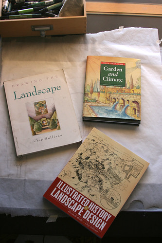
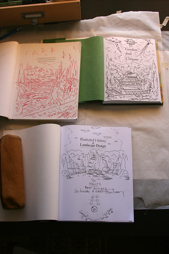
Chip was a professor of mine (my favorite I dare say) at the Landscape Architecture program at UC Berkeley. His lectures and projects were always fun and he was one of those professors who would go for a beer with a group of students after class, encouraging impromptu coaster illustrations amid discussions of landscape theory. His life-long fondness for comics and illustrative arts were strong themes in his teachings. We felt very free to experiment with design and materials in his studio. I did some of my favorite projects in that class, ones that still influence me today.
Liz Boults teaches Landscape History at UCDavis and was responsible for the text of the book. Based on the idea of a graphic novel, the text is still an important aspect and she is succinct yet thorough with the descriptions. With Liz's text and Chip's illustrations they have put together a unique presentation of landscape history.
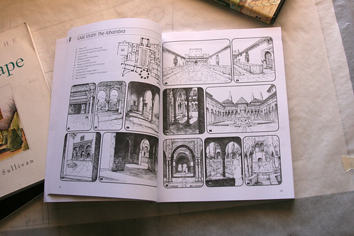
Chip began the evening's lecture stating that one can often get a clearer idea of a space from a drawing than a photograph. At first I disagreed with his statement, but after seeing a few slides of the book's illustrations, I began to see his point. And that is one of the best features of this (mostly) graphic novel. In Chip's capable hands one is able to understand the space and flow of many well-known gardens throughout landscape history. I've seen photos of many of these gardens before but the combination of the illustrations and the accompanying text made clear ideas that I had previously not been able to see - forced perspectives, axle relationships, and how one moves through and views the gardens at different points. The drawings eliminate distractions and simplify the spaces into the main themes. (I of course prefer to think this simplification and clarity is the result of good illustration and descriptive text, rather than my mind's inability to concentrate on long verbose garden descriptions that I've read before and not gotten much from.)


Many of the gardens in the book are able to create a sense of mystery or surprise by directing the path of the viewer, creating interest and opening to views for dramatic effect. The mystery of the garden is when one realizes that it not as it seemed when first viewed - the destination is not as near as one thought, the path is more circuitous than it seemed. I don't know if the topic of garden mystery was completely covered by the lecture, but I was OK with that. I attended mostly to hear about the book and was not disappointed in that respect. The book and lecture, in fact, de-mystified these gardens with clear drawings and descriptions so that one could understand the designers' intent and execution, and possibly learn from them. Of course, many of these landscapes are on a grand scale and may be hard to translate into the average residential design. But even then, Chip's illustrations make the book valuable enough to me. They are excellent examples of graphics one may strive to emulate.
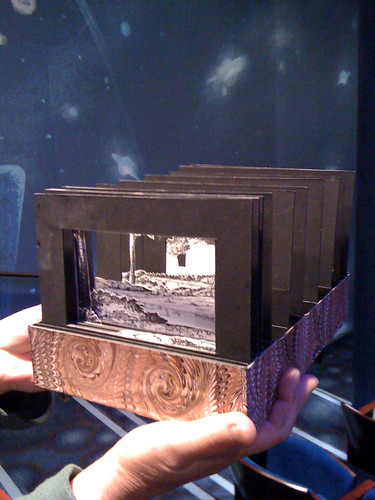
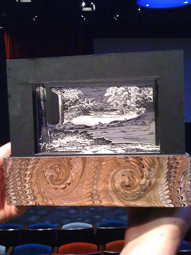
Chip also passed around a multi-layered landscape diorama that I would love to try as a presentation tool for clients. Of course they would take forever to make, but the layered drawings really created a sense of depth to the scene and could allow for easy interchanging of elements.
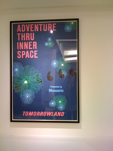
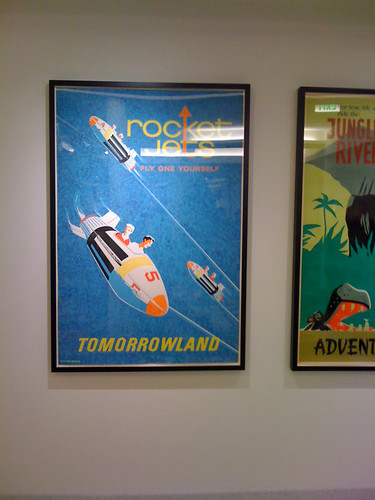
On a side note the location of the lecture couldn't have been better. At the new Disney Family Museum in the Presido, there were vintage Disney landscapes and storyboards all around. Chip didn't fail to notice and seemed quite happy to make the connection between the location and the lecture. Here are a couple of posters I snapped photos of. (Innerspace-sponsored by Monsanto! Yikes!) and a very trippy floor.

But Liz and Chip make a great team and they have combined to create a truly unique landscape history book and have done a terrific job with the presentation. I look forward to their next joint venture.


Chip was a professor of mine (my favorite I dare say) at the Landscape Architecture program at UC Berkeley. His lectures and projects were always fun and he was one of those professors who would go for a beer with a group of students after class, encouraging impromptu coaster illustrations amid discussions of landscape theory. His life-long fondness for comics and illustrative arts were strong themes in his teachings. We felt very free to experiment with design and materials in his studio. I did some of my favorite projects in that class, ones that still influence me today.
Liz Boults teaches Landscape History at UCDavis and was responsible for the text of the book. Based on the idea of a graphic novel, the text is still an important aspect and she is succinct yet thorough with the descriptions. With Liz's text and Chip's illustrations they have put together a unique presentation of landscape history.
Chip began the evening's lecture stating that one can often get a clearer idea of a space from a drawing than a photograph. At first I disagreed with his statement, but after seeing a few slides of the book's illustrations, I began to see his point. And that is one of the best features of this (mostly) graphic novel. In Chip's capable hands one is able to understand the space and flow of many well-known gardens throughout landscape history. I've seen photos of many of these gardens before but the combination of the illustrations and the accompanying text made clear ideas that I had previously not been able to see - forced perspectives, axle relationships, and how one moves through and views the gardens at different points. The drawings eliminate distractions and simplify the spaces into the main themes. (I of course prefer to think this simplification and clarity is the result of good illustration and descriptive text, rather than my mind's inability to concentrate on long verbose garden descriptions that I've read before and not gotten much from.)


Many of the gardens in the book are able to create a sense of mystery or surprise by directing the path of the viewer, creating interest and opening to views for dramatic effect. The mystery of the garden is when one realizes that it not as it seemed when first viewed - the destination is not as near as one thought, the path is more circuitous than it seemed. I don't know if the topic of garden mystery was completely covered by the lecture, but I was OK with that. I attended mostly to hear about the book and was not disappointed in that respect. The book and lecture, in fact, de-mystified these gardens with clear drawings and descriptions so that one could understand the designers' intent and execution, and possibly learn from them. Of course, many of these landscapes are on a grand scale and may be hard to translate into the average residential design. But even then, Chip's illustrations make the book valuable enough to me. They are excellent examples of graphics one may strive to emulate.

Chip also passed around a multi-layered landscape diorama that I would love to try as a presentation tool for clients. Of course they would take forever to make, but the layered drawings really created a sense of depth to the scene and could allow for easy interchanging of elements.


On a side note the location of the lecture couldn't have been better. At the new Disney Family Museum in the Presido, there were vintage Disney landscapes and storyboards all around. Chip didn't fail to notice and seemed quite happy to make the connection between the location and the lecture. Here are a couple of posters I snapped photos of. (Innerspace-sponsored by Monsanto! Yikes!) and a very trippy floor.


But Liz and Chip make a great team and they have combined to create a truly unique landscape history book and have done a terrific job with the presentation. I look forward to their next joint venture.

Thank you for sharing this...I was curious about the book. LOVE the dioramas and the floor!
ReplyDeleteI've got a copy, too, and I like it a lot. There's some interesting stuff about garden history, and Chip's drawings are always fun to check out.
ReplyDeleteReally nice information about landscaping. This is so much more than i needed!!! but will all come in use thanks!!
ReplyDeleteLandscape designer virginia
Hi Thanks for sharing this blog .The info of this blog is very good and the creativity is really very fantastic.
ReplyDeleteLandscape Designer Virginia