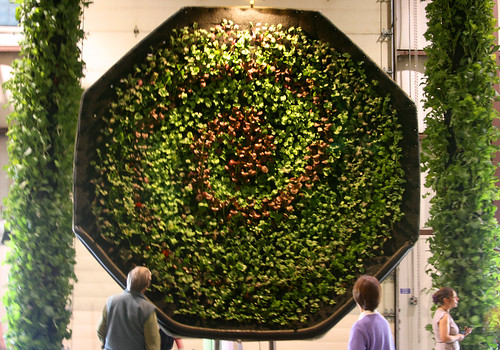
One of the most interesting gardens was Inka's hydroponic vegetable gardens. The first portion of their set up created a spiral pattern in a large dish with two gigantic rotating columns of veggies on either side. The effect was quite hypnotic and I began to hear slow, deep voices in my head saying "You WILL eat your veggies, You WILL eat your veggies. "
It must have been emanating from their sign which was disturbingly HAL like.
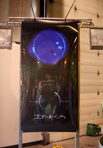
But I have to say I enjoyed the aesthetics of the display. It was beautifully crafted and served well to play up the Sci-Fi aspects of this type of vegetable growing.
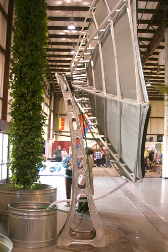
I was quite curious to check out the other side of their display which included a fish tank that provided nutrients for the vegetables.
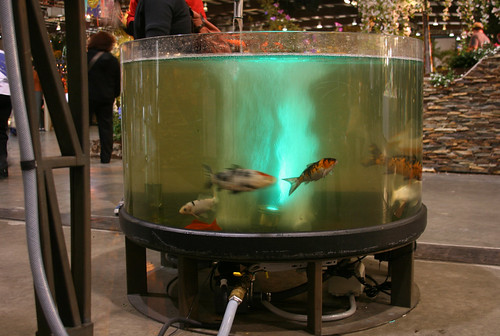
I recently heard of "Aquaponics" in a NY Times article. But after reading the article, I was quite confused by the whole setup and honestly, I found it really ugly. I like that Inka has tackled it in a simplified and clean way. The guy I spoke with at their display also revealed they had only 21 days to get their garden together. Bravo to a really cool company!
And of course The Cube. An Organic Mechanics' creation, I couldn't walk past it without taking a photo so bear with me:
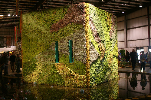
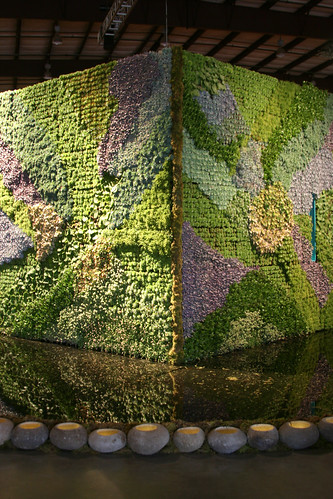
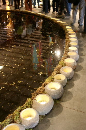
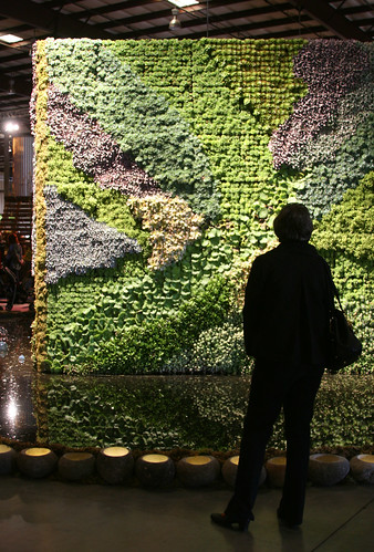
The corner view was probably my favorite. The light-ringed moat was a beautiful touch, very good for creating a sacred space amid the chaos and also for keeping people from fondling the succulents too much.
The planting of the walls was done in a very painterly way. One could stand back and appreciate each wall as in individual painting in a gallery.
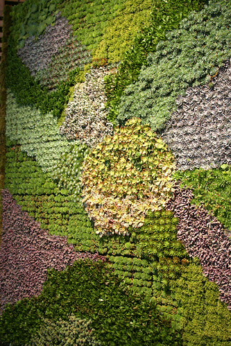
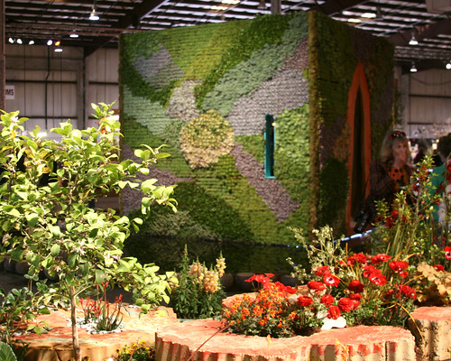
The Cube also made an excellent backdrop to some of the more loosely planted gardens like Keela's. The contrast between the rigid form and the natural shapes was quite nice. I'd love to have this as a shed and counterpoint in my own garden. I suppose Organic Mechanics are done with it now- feel free to just bring it on over guys! Course it'd take up most of my backyard.
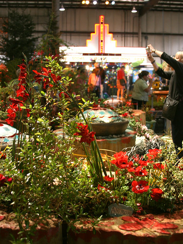
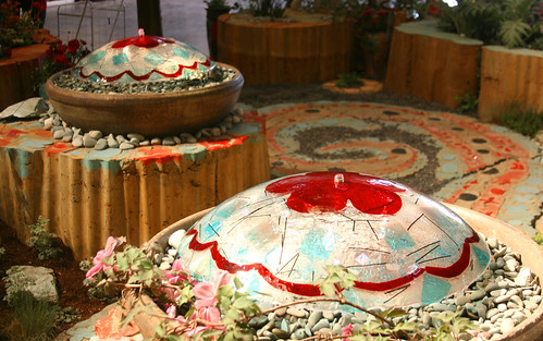
The color in Keela Meadows' garden of course totally impressed me. Her garden gave the fast food neon sign a run for its money.
Loved her cast concrete planters, man-made yet of nature at the same time.
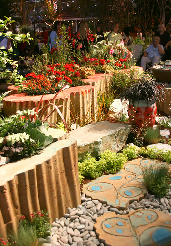
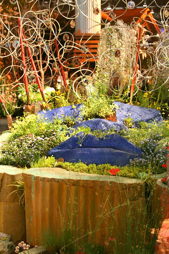
Her garden, although hard to see the full layout, was composed of a body with legs, arms, etc. Here are the mammary glands and lips for ya.
As I was walking around I came up with some of my own person awards.
For Most Stylin' Chicken Coop:
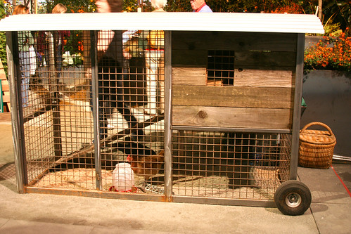
I can totally see that parked in front of Flora Grubb Nursery.
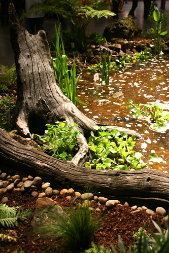
For Best Use of Stumps:
For Garden I Would Most Have to Struggle to Keep My 3 Year Old Off:
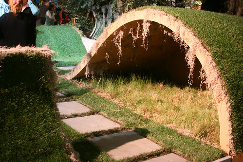
Confessional: My son climbed on (and broke) part of Shirley Watts garden at the Late Show for which I will be eternally embarrassed.
For Best Ginormous Metal Animals and Best Use of Leaf Litter:
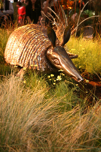
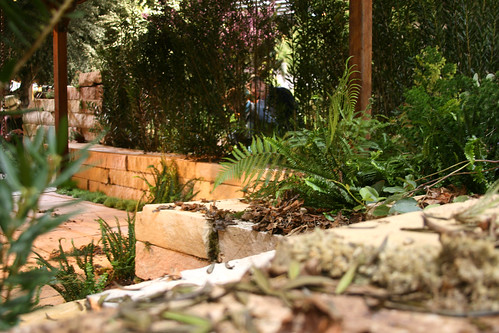
All I can say is that when humans are gone I really, really hope the world is populated with giant golden armadillos. That would make me happy.
For Most Oddly Aggressive Native Garden:
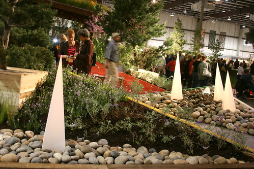
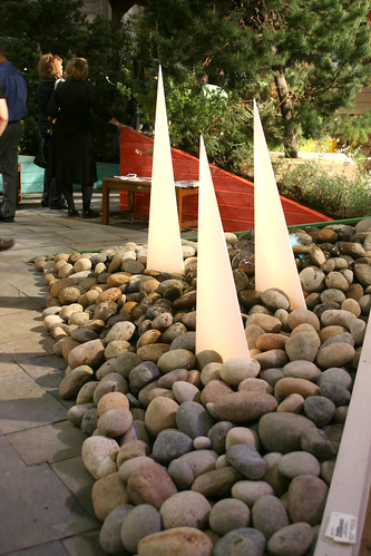
All the different angles happening in this garden messed with my equilibrium and made me feel like I was in a carnival funhouse. And I felt like I might trip on a rock and poke my eye out on something sharp.
And For Boring the Sh*t Out of Me:
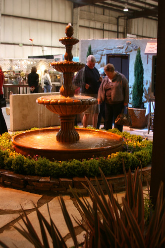
Sorry, I try to be nice most of the time.
And now to switch gears because I've saved my favorite for the last. Mary Te Selle's Tree House Garden was great. I so wanted this garden to exist in real life. I would have loved to photograph it in natural light and see it change over the seasons. It was very mysterious and wild and I sort of felt like I should be wearing my Where the Wild Things costume while looking at the garden.
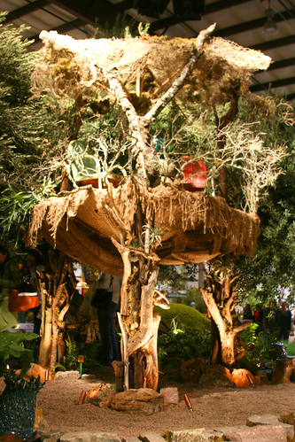
And the details were so wonderful. The ancient oaks, the ceramics, the pond and the plantings were all so lovely. The metal bits I wanted to drag home with me.
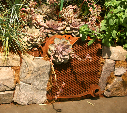
I especially enjoyed the view from the back. It made me feel like I was lurking in the undergrowth, like I might be inclined to dash out and nip after someone's ankles as they walked near the treehouse. (In my defense, this thought did occur to me on my third day at the show and I was feeling pretty tired and delirious at this point.)
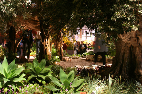
And over in the Kids' Garden Room, one young garden designer was on the same page as Mary! Cool! Looking forward to seeing him at the show in a few years.

It must have been emanating from their sign which was disturbingly HAL like.

But I have to say I enjoyed the aesthetics of the display. It was beautifully crafted and served well to play up the Sci-Fi aspects of this type of vegetable growing.

I was quite curious to check out the other side of their display which included a fish tank that provided nutrients for the vegetables.

I recently heard of "Aquaponics" in a NY Times article. But after reading the article, I was quite confused by the whole setup and honestly, I found it really ugly. I like that Inka has tackled it in a simplified and clean way. The guy I spoke with at their display also revealed they had only 21 days to get their garden together. Bravo to a really cool company!
And of course The Cube. An Organic Mechanics' creation, I couldn't walk past it without taking a photo so bear with me:


The corner view was probably my favorite. The light-ringed moat was a beautiful touch, very good for creating a sacred space amid the chaos and also for keeping people from fondling the succulents too much.

The planting of the walls was done in a very painterly way. One could stand back and appreciate each wall as in individual painting in a gallery.


The Cube also made an excellent backdrop to some of the more loosely planted gardens like Keela's. The contrast between the rigid form and the natural shapes was quite nice. I'd love to have this as a shed and counterpoint in my own garden. I suppose Organic Mechanics are done with it now- feel free to just bring it on over guys! Course it'd take up most of my backyard.

The color in Keela Meadows' garden of course totally impressed me. Her garden gave the fast food neon sign a run for its money.

Loved her cast concrete planters, man-made yet of nature at the same time.

Her garden, although hard to see the full layout, was composed of a body with legs, arms, etc. Here are the mammary glands and lips for ya.


As I was walking around I came up with some of my own person awards.
For Most Stylin' Chicken Coop:

I can totally see that parked in front of Flora Grubb Nursery.
For Best Use of Stumps:

For Garden I Would Most Have to Struggle to Keep My 3 Year Old Off:

Confessional: My son climbed on (and broke) part of Shirley Watts garden at the Late Show for which I will be eternally embarrassed.
For Best Ginormous Metal Animals and Best Use of Leaf Litter:


All I can say is that when humans are gone I really, really hope the world is populated with giant golden armadillos. That would make me happy.
For Most Oddly Aggressive Native Garden:


All the different angles happening in this garden messed with my equilibrium and made me feel like I was in a carnival funhouse. And I felt like I might trip on a rock and poke my eye out on something sharp.
And For Boring the Sh*t Out of Me:

Sorry, I try to be nice most of the time.
And now to switch gears because I've saved my favorite for the last. Mary Te Selle's Tree House Garden was great. I so wanted this garden to exist in real life. I would have loved to photograph it in natural light and see it change over the seasons. It was very mysterious and wild and I sort of felt like I should be wearing my Where the Wild Things costume while looking at the garden.

And the details were so wonderful. The ancient oaks, the ceramics, the pond and the plantings were all so lovely. The metal bits I wanted to drag home with me.

I especially enjoyed the view from the back. It made me feel like I was lurking in the undergrowth, like I might be inclined to dash out and nip after someone's ankles as they walked near the treehouse. (In my defense, this thought did occur to me on my third day at the show and I was feeling pretty tired and delirious at this point.)

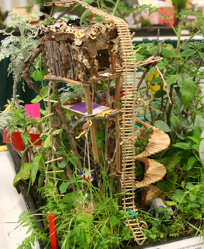
And over in the Kids' Garden Room, one young garden designer was on the same page as Mary! Cool! Looking forward to seeing him at the show in a few years.


Love seeing your excellent photos of the show which make me wish I had longer to scope things out. I read that NYT article too and would have liked to see that aquaponics operation in action. And stop feeling bad about the Watts Late Show garden. I saw a woman sit on it and rip a panel at the preview -- it just had that invitation to sit all over it. Your little guy wasn't the only one!
ReplyDeleteThis IS a totally rad post! I love your awards, and I feel the same way about the boring garden. Well, without a boring garden, there isn't as much contrast for the other, totally groovy gardens.
ReplyDeleteIt was super cool to meet you at the show! I hope I get out there again before four more years roll around!
Awesome post, so glad I was able to meet you in person (and ogle your cool camera while you were taking these shots!) It was a great Show, thanks for your thoughtful (and hilarious) observations!
ReplyDeleteHoly Cow - your photos are the best I've seen YET! Gorgeous eye you have, young lady! And I love your interpretations of the gardens...
ReplyDeleteSo glad to meet you in person - and of COURSE you work at Annie's Annuals...you all are just so darn awesome. Makes me want to send in a job application...
Denise- That is so funny you saw a woman break Watts' panel too! Not funny for her...but that does make me feel better. Thanks, and I'm heading over to check out your interesting looking blog in just a minute!
ReplyDeleteKatie- Thank you! And yes SFGS was so full of good groovy-ness that one little area of boredom is almost a relief! Actually, I did picture coming across this garden in a courtyard somewhere and imagined it could be quite pleasant. There-that's my niceness for the day.
Laura-So good to meet you too! Hope to bump into you again sometime!
Rebecca-You're so kind! And that would be so cool to have you at Annie's! Hope to see you soon.
What a creative filled hall, well except for the cheesy fountain (that would have been oh and a'ed over here). My favorite was the cube, it kind of reminded me of The Black Stone of Mecca, worthy of worship only green and not in Mecca.
ReplyDeleteExcellent post - one of my favorite reviews to date. You have an excellent eye.
ReplyDeleteGreat eye & great descriptions. I look forward to reading more posts from you.
ReplyDeleteLes- It was totally like the Black Stone of Mecca.Good comparison!
ReplyDeleteSusan- Thank you so much. I enjoyed your post about SFGS too. (And thanks for the Annie's mention!)
Dirt Guy- Thank you!
a "boring the sh*t out of me" award.
ReplyDelete-that's genius!!