UC Berkeley's Plant Lab - I have to admit I was intrigued. Twin banks of grow lights lit up the graphic, sterile lettuce landscape. Pushing the limits of the concept of gardening, this creation brought to mind images of computer-aided 3-D topo maps, nursing homes filled with IV drips, and indoor pot farms. Well-edited down to the simplest of materials, but completely impractical. Or is it? I really, really hope that this ends up in someone's backyard for a trial run in the real world, a world with weeds, curious squirrels and strong winds. Lose the grow lights and see if it can become a simple, beautiful hanging garden.
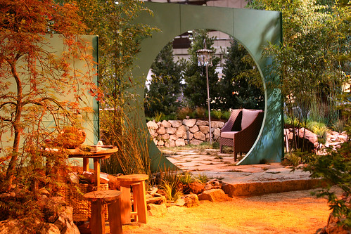
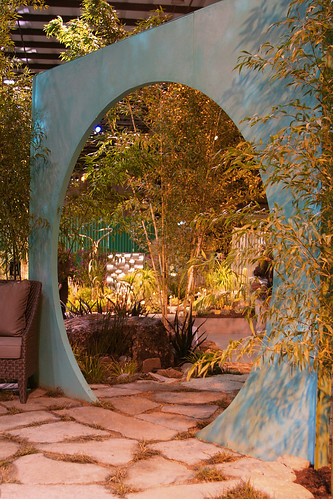
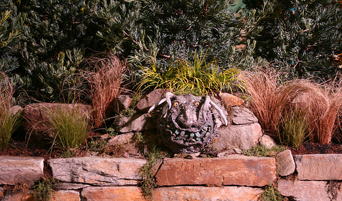
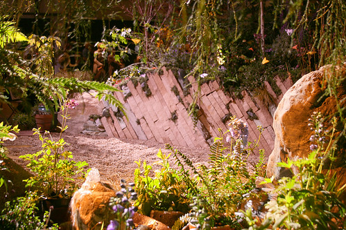
Kind of a cool moon gate at Saunders Designs "Reality Rocks" exhibit. The rocks with faces freaked me out though. I don't think I'd feel comfortable walking through the garden at night with those things lurking about.
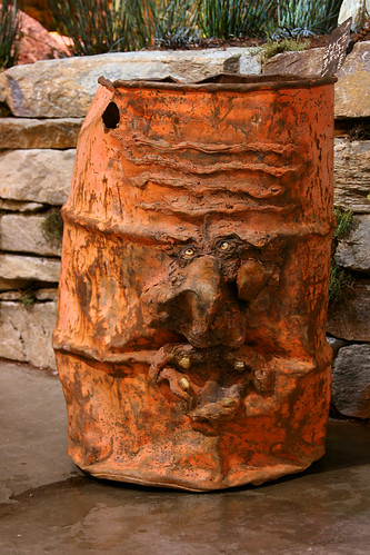
The trash can was pretty cool though.
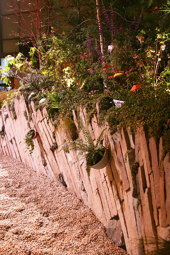
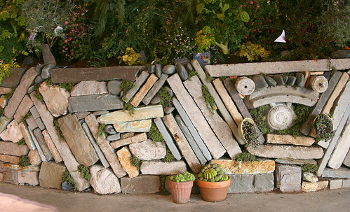
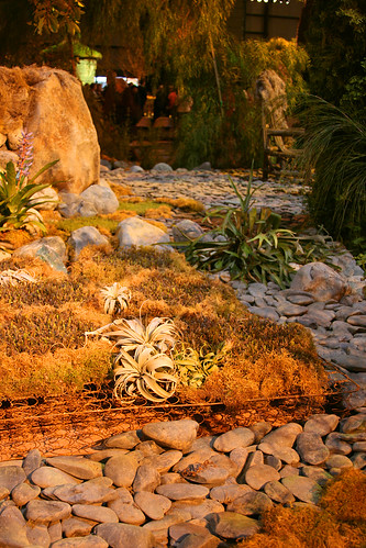
Love the stonework in Mariposa Gardening and Design's "Changes".
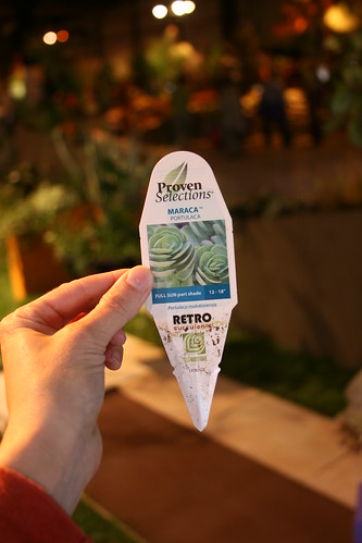
Ah Sam Florist and Greenhouse had an interestingly shaped trellis/arbor that was impossible to photograph. They also had a plant I must have, Portulaca 'Maraca'. Hopefully it is hardy around these parts.
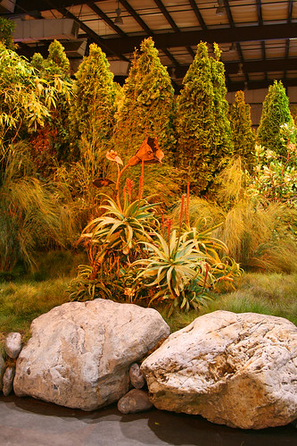
Quite Contrary Garden Design had some lovely large boulders as well as a nifty rusty bedspring that I would love to pull off the ground, hang on a wall and plant with epiphytes. But all those large boulders and giant cypress soldiers felt like they were protecting something on the inside and I never felt like I was able to figure out what. It felt very impenetrable and fortress like. If we'd been able to walk into it, I might have enjoyed the protected space.
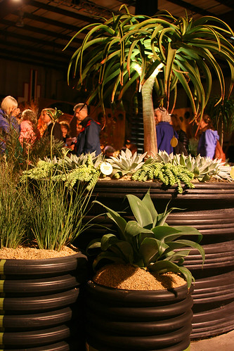
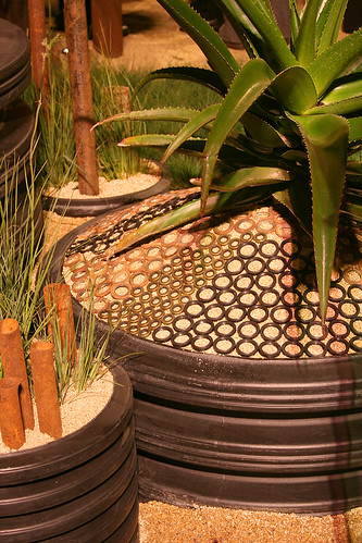
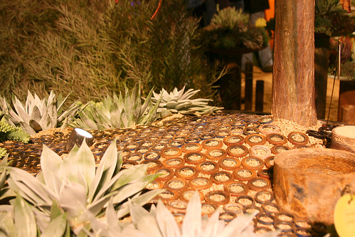
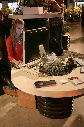
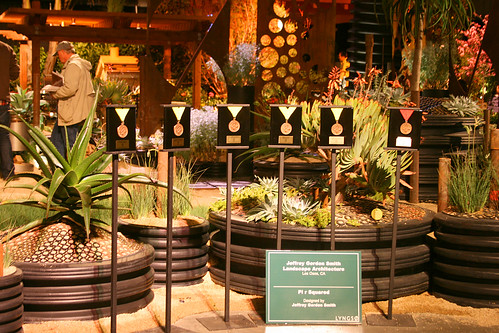
Certainly garnering the most attention was Jeffrey Gordon Smith's "Pi R Squared". The main elements were planting containers made of left-over pieces of large black drainage pipe, grommets galore, and rusty pipes and sheet metal. It all comes together for a dramatic look although I have to admit I wouldn't care for some of the materials in my own garden, a public garden would be more appropriate perhaps. Don't get me wrong, I love rusty things, I guess it was the black plastic that didn't appeal.
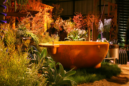
The hot tub seemed out of place with its pudgy, glossy orangeness, although it did go with the circular theme.
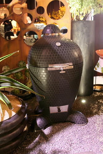
I couldn't keep my hands off that black Komodo grill though. It was caress worthy, the lingam of bbq's. And I did quite like those tables they put together.
Continuing the circular theme was the row of medals, quite the lineup.
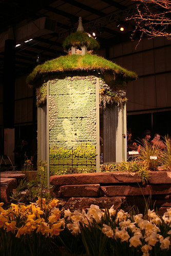
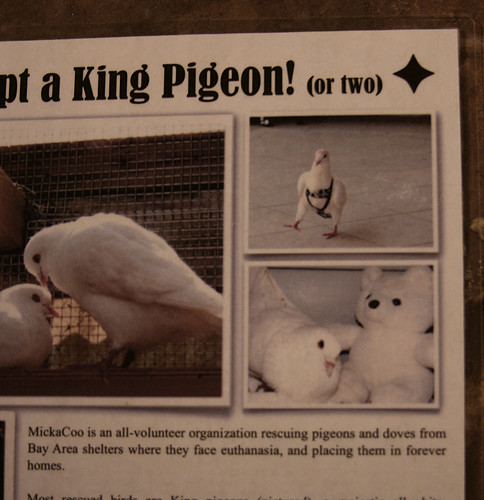
Filoli's dovecote and bulb extravaganza was very pretty. The adopt a pigeon handout cracked me up though. Can anyone explain what is going on with the dove in the harness? :)
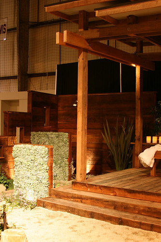
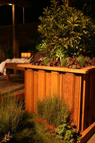
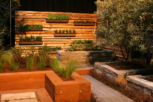
I was impressed with the West Valley College Landscape Architecture Club's piece. It was clean and simple and totally something I would want to have in my backyard. I loved the wood wall with windows and the raised beds faced in rusty siding.
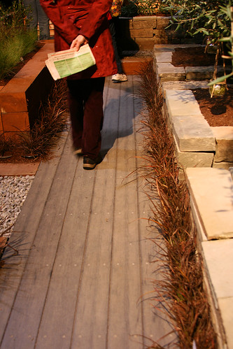
The McKenna Landscape split-rail wall was very nice. I'd like to see how it will weather. And I'm totally stealing their idea of using Phormium 'Jack Spratt' as a pathway edger in tight spaces between hardscape.
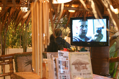
But I think the weirdest garden was Goulart Design's tiki lounge/vivarium with terrariums scattered about. I guess they wanted the garden to feel "wild" with exotic animals but the bright glass boxes made it kind of hard pretend to be in Costa Rica. And I have to say the TV with violent non-family programing kind of spoiled the vibe too.
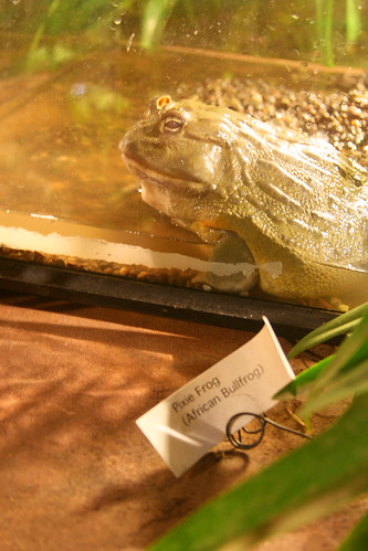
I did get a kick out of the "Pixie" Frog though. That thing must've weighed 5 lbs!

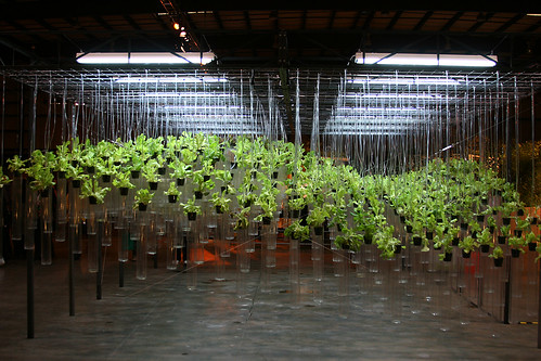
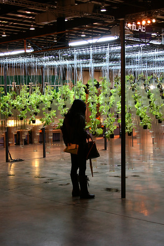
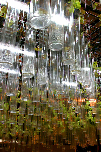

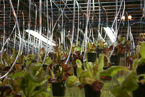
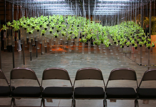
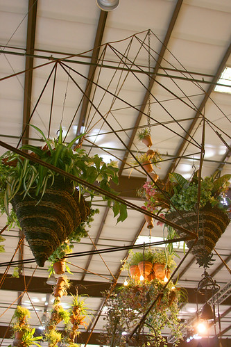
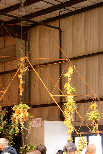

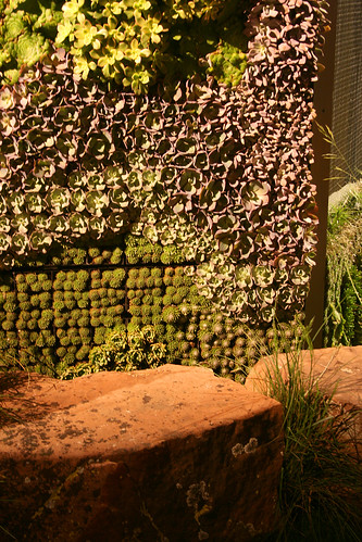

I did wonder about the plant lab. Are the plants in pots which are in glass tubes? The plastic used to hang the glass tubes are fixed to the tubes?
ReplyDeleteOh and I like the bedspring idea too. Thanks for sharing this.
Dove in a harness. I noticed that one of the dove handlers had a dove on her shoulder. Umm.. that dove had a "diaper" on to protect her clothing. Might that harness be part of the diapering process?
ReplyDeleteFun and funny post, Kelly. You have a great attention to detail and nuance - I walked around the show several times (dead tired in my defense!) and didn't see some of the pretty things you captured. I am especially sad I missed the dove in a harness!
ReplyDeleteInteresting to see how differently and similarly we saw the display gardens.
ReplyDeleteI was expecting some sort of interactivity or meaning in the salad lab. Say that the height of the individual plants was determined by the weight of the plant or how much water the plant had gotten lately or something like that. Heck, it's Silicon Valley -- where is the API documentation? :-)
Now I understand that I couldn't find the "Quite Contrary" garden that a friend was talking about. It didn't feel like a garden.
The grommet mulch wouldn't have worked in RL the way it was done in the display garden. Those grommets were just placed on top of the soil. You can imagine what happens when a dog tears through that chasing a ball, or a cat makes a "deposit" in the sandy soil...
That orange hot tub? Looks to me like it was placed by a sponsor. And who even comes up with the idea of attaching a wok to a hot tub? I mean, come on. How is that practical?
Agreed that the West Valley College garden was neat. Just like you, I can totally see myself enjoying it in real life. Outrageous display gardens are fun but West Valley were keeping it real. I like that.
This was a wonderfully thoughtful review and your photography is absolutely drop dead stunning.
ReplyDeleteI appreciated the 'Salad Greens on an I.V. drip" as horticultural theater.
I found the stone work in the Filoli garden to be beautifully rendered and the simple planting of daffodils pertinent to the over all feel that Filoli emotes in the spring time.
The garden by Mary TeSalle left me scratching my head in confusion. It felt inside out and walled off. There was no wow factor nor a central point of perspective to lead one into the garden.
I liked a lot of the elements in Jeffery Gordon Smiths garden but the wood fired hot tub seemed like it was dropped into the middle of the garden rather than integrated in the garden. And sorry, but a wood fired hot tub is soooo not environmentally forward thinking ( Spare the Air !)
I also like the solid craftsmanship in Randy Shadrick's garden, Outdoor Environments. Nice tight clean design.
Thanks for capturing some great photos of the show. You have a innate talent with the camera !